Building narrative
I had some association with the Whittier History Museum that prompted me to propose some upgrades to the exhibition space. The building was jovial assortment of local history exhibits & early Americana artifacts presented without much of a narrative layer. There were letter size signs around the exhibition that looked like they were set in Microsoft Word, all in a slightly different style and none suiting the scale of the space itself. I wondered as a prospective visitor might : Why are all of these objects here? What’s the story of this place? The didn’t really want to change the exhibits themselves, so it was more the interpretive element that I chose to focus my energy on.
The easiest and most effective way to help visitors get more from their time was to contextualize each area and bring some meaning to the objects therein. I did this with a large entry sign that asked the question “What is Whittier?” and then answered that question with a series of similarly formatted signs throughout the exhibit space. Smaller signs for individual objects matched the visual style of the overarching brand and lent a familiar repetition throughout the visit.
Revisiting a president
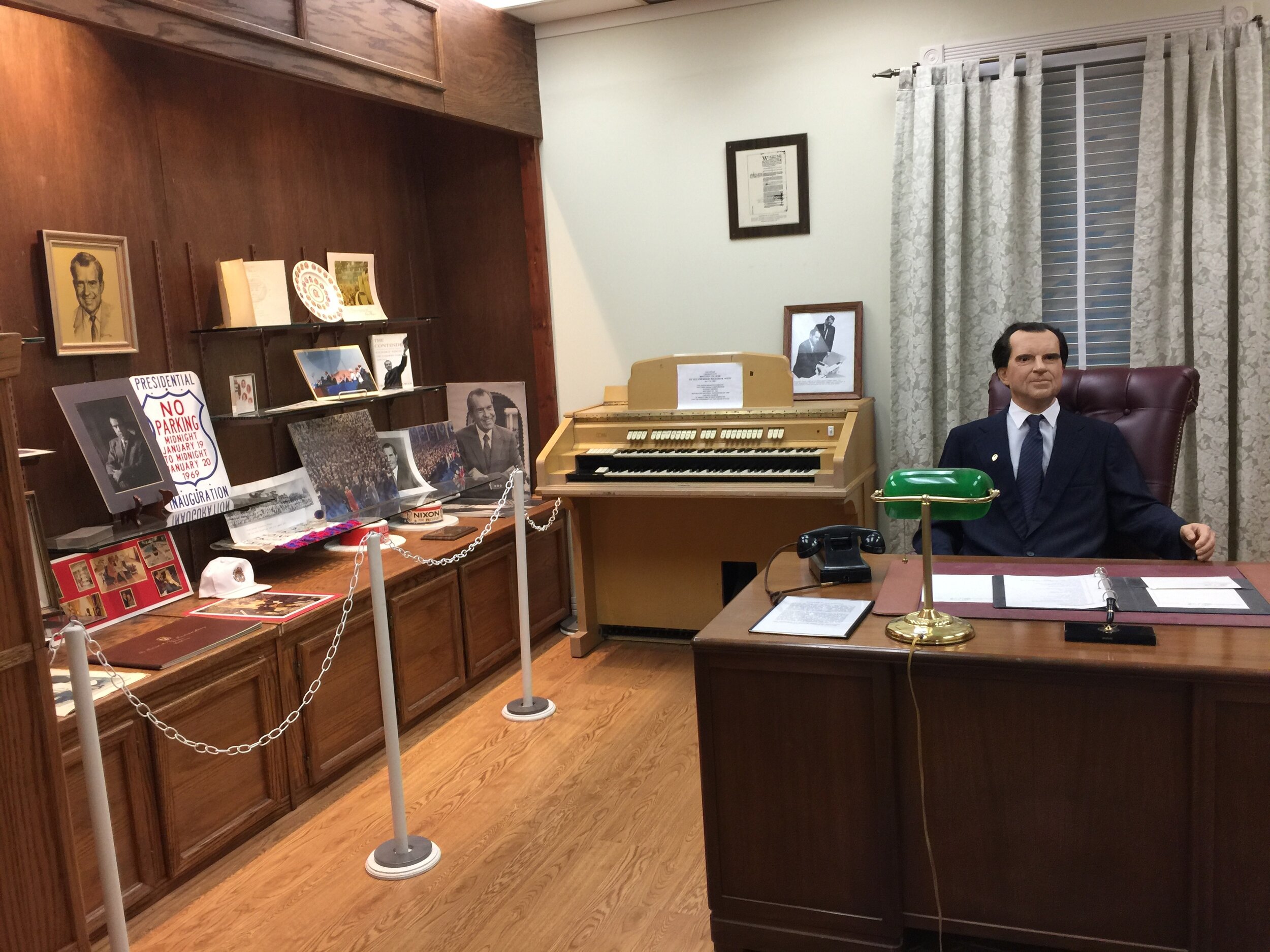
After this initial curatorial pass at the ground level, the Museum received a grant to revamp one of its signature exhibits on the second floor dedicated to local boy Richard Nixon. One of his lifelong friends wanted to reinvigorate interest in Nixon and inject himself into the legend. I raised some concerns about donors meddling in the presentation of historical information, but where there’s a quid there’s a quo, and so we began taking a critical look at the exhibits contents, presentation and narrative.
With a critical eye on the room’s contents, the staff and I began organizing things into a chronological order, eliminating redundancy and identifying holes in order to give the exhibit a comprehensible flow. We got rid of a few things and added a few, most notably a monitor that played public domain video highlights of Nixon’s presidency. That was a tough sell considering the scandal the president was involved in, but it was seen as an important part of the story and something visitors would expect to see. Best to present it in context than invite unenlightened speculation.
I started off by giving the bottom layer an even coat of rich, presidential blue that unified the broken up wall surfaces. The dramatic color shift in the hallway continued into the main exhibition room and unified the whole presentation, setting a formal tone with context and background imagery before drawing visitors into the exhibit itself.
On top of that was some type and graphics applied to the walls, a bunch of new frames with a unified feel and a reorganization of the exhibition materials to present more of a linear narrative starting with Nixon’s youth and progressing through his administration and beyond.
Starting the visit off with a little introduction and some context helps people understand what to expect.


